

The Wonderful Machine brand is
clever • sophisticated • friendly • clean
Wonderful Machine is a production company with a curated network of over 700 commercial photographers
and videographers all over the world. They are the premier choice for finding the world's best commercial photographers, sourcing images and producing shoots of the highest caliber.


SERVICES
Logo Development
Brand Strategy
Visual Identity Design
Creative Direction
Stationery & Collateral
Signage & Spaces
Social Media Strategy

Logos, Mark & Taglines
The primary logo and tagline make up Wonderful Machines’s master logo. While the vertically oriented primary logo should be used whenever possible, an alternate horizontal version supports versatility and provides flexibility, especially when space is lacking.
The mark embodies the values and spirit of Wonderful Machine, and it can be used on its own to strengthen brand recognition due to its iconic nature.
The hand-lettered taglines support the playful and dynamic spirit of the brand. The primary tagline represents WM's photographer and stock search capabilities, while the other promotes WM's shoot production services.
Each element of the brand is designed to sustain legibility, especially at small sizes.

Anatomy of the Mark
The Idea • WM thrives on ideas and the limitless potential they bring, which is why their mark alludes to an iconic single light bulb, bright and shining.
The Pin • Location is a core focus for WM—every day they help clients find photographers, plan shoots, and source images all over the world.
The Dial • The WM team is made up of many moving parts, working seamlessly and efficiently together as one—like
a machine does with the turn of a dial.The “W” • It's essential to instill brand recognition at every touch point, starting with subtly echoing the “W” of Wonderful Machine in the primary mark.
Iconography
the Camera Icons
Wonderful Machine has two distinct camera icons. The icon depicting the front of the camera addresses clients, representing the WM's curated network of photographers and the search interface clients use to find them. The icon depicting the back of the camera indicates photographer-facing content, and is designed to literally be the side of a camera facing the photographer.
Client vs. Photographer-Facing Camera Icons
Primary Icons
These icons represent the the three primary areas of the company and utilize same the double circular border and the blinking rays to echo the logo mark.
Find Photographers
Shoot Production
Stock Requests
Photographer Consulting Icons
Wonderful Machine has an icon for each of their six photographer consulting departments. Gold is designated as the primary accent color for photographer-facing content.
Photo Editing
Design
Publicity
Marketing
Estimating
Production

member benefit icons
These icons illustrate the numerous benefits of becoming a Wonderful Machine member photographer. A coveted listing on their curated search interface is only the beginning.
The Pattern
This seamless pattern is created from the collection of Member Benefit icons. Its playful nature enhances the personality of the brand, and can be used in a variety of contexts to add interest and unexpected delight for clients and photographers alike.
Online Presence

Homepage

Photography Search Results
We first found Sparkbox—a web design and development company based in Dayton, Ohio—through Typefight, one of their online passion projects. Based on that project, Melissa reached out to them way back in February, 2014 as a contender for developing Wonderful Machine's new site.We began the process with a content audit where we evaluated each page of our existing site, which of our audiences that information was targeted toward, and whether that information or its location needed to be reconsidered.
From that point on, they worked with us to redefine the Wonderful Machine web experience from the ground up. Their team brought our vision to life on the photographer search, making it intuitive and practically addictive to use. They helped us distinguish our client-facing content from photographer-facing content, giving our photographers a dedicated portal of information just for them. They also helped us integrate a password-protected section into that portal so we can better provide exclusive content and additional value for our member photographers. On top of all that, they built our new site responsively, so that the look and experience are seamless, no matter what screen size you're viewing it on.
IMPLEMENTATION, CONSULTATION by Sparkbox
Brand Swag

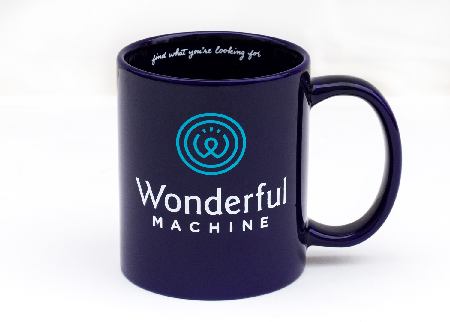
What is a new brand without some sweet brand swag to go along with it ? Our designer Samantha translated Wonderful Machine's new logo into some new brand swag, which includes mugs and t-shirts (so far).

Signage
Shortly after the new branding was complete Wonderful Machine was slated to move offices. They had had been in their current space for about 6 years and were rapidly outgrowing the space. So the search began for a new office which we happened to find across the parking lot. We moved along with the Wonderful Machine team into our very own 4100 square foot building. To make the move more official Melissa, designed signage featuring our Wonderful Machine's new branding for the front and back doors, front entryway and conference room.


Promotional Materials
Both Melissa and Samantha teamed up to rebrand as well as create promotional materials for the new Wonderful Machine including a print mailer, email promotions and banner stands.


